Our eyes view images in an order, the rules which influence this order is know as Composition.
Deliberate choice in value ranges will make any art read well, from simple boxes and circles to complex paintings. It is important you are carefully considering how the black and white values in your image affect how easy it is to distinguish the difference between Actors props and Depth.
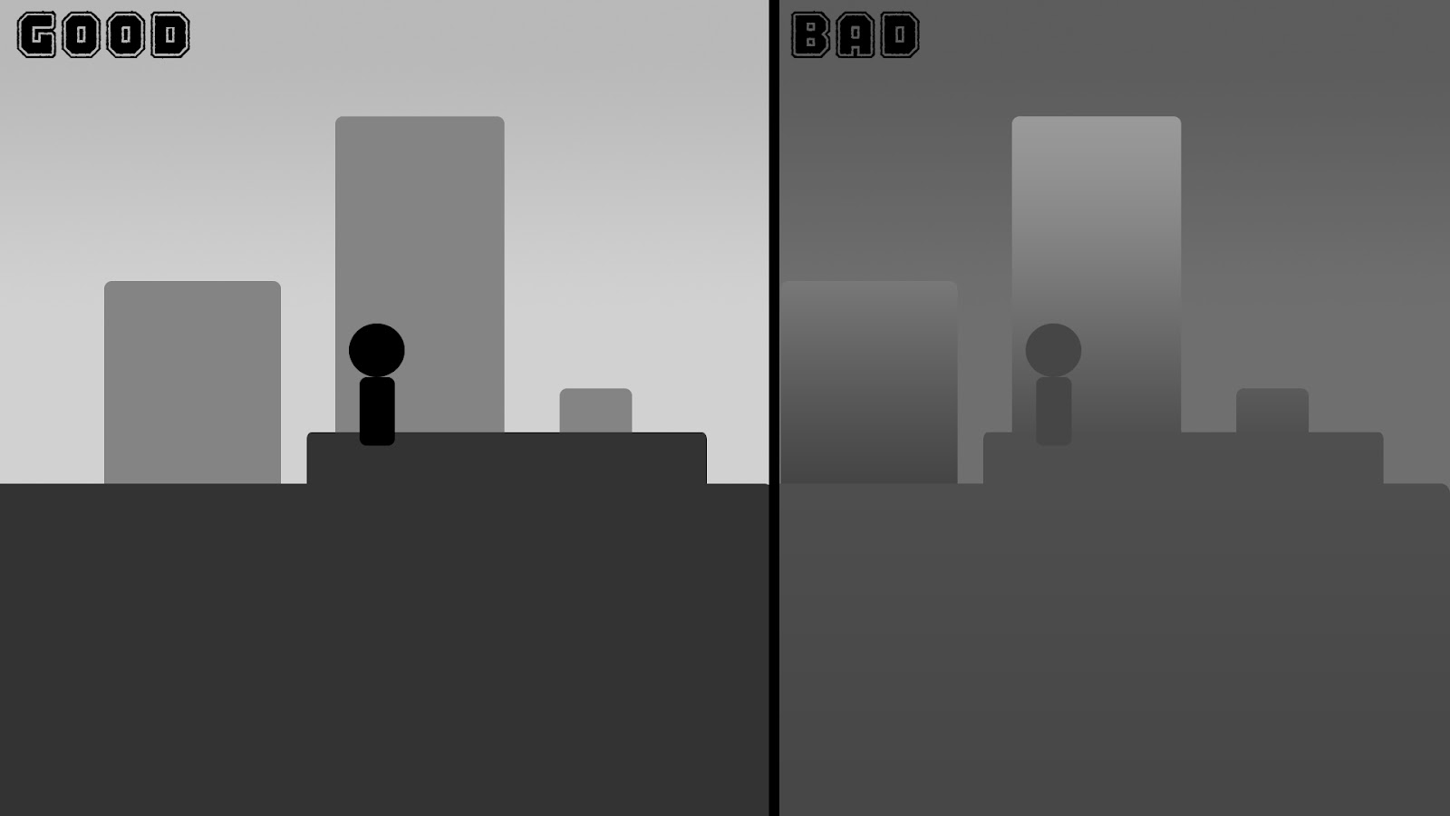
The example above on the left shows an example of boxes being used to construct an environment one with clearly defined value ranges for foreground, midground, background and the player. The other to the right shows the same scene with ranges which aren’t clearly defined.
It is important you use this knowledge to create both the illusion of depth and highlight actors in your games environment should be easy to spot/identify. A good rule of the thumb is to have the main actors and creatures have more contrast than their surroundings to visually aid the player of the choices and threats which surround him.
This rule applies to similar to: Complexity of Shape/Silhouette, Scaling of Details and colour. But is best demonstrated with black and white values as they show the impact the clearest.
Below is an example screenshot taken from the popular MOBA game League of Legends. An experienced artist will be trained to view each individual aspect of the scenes art. Values, colour, scaling for details, Shading complexity etc.

You can views these aspects of a games art individually using tools such as Photoshop. The example below shows the scene in black and white values without any colour. You can now more easily view how League of Legends uses Values in there game.
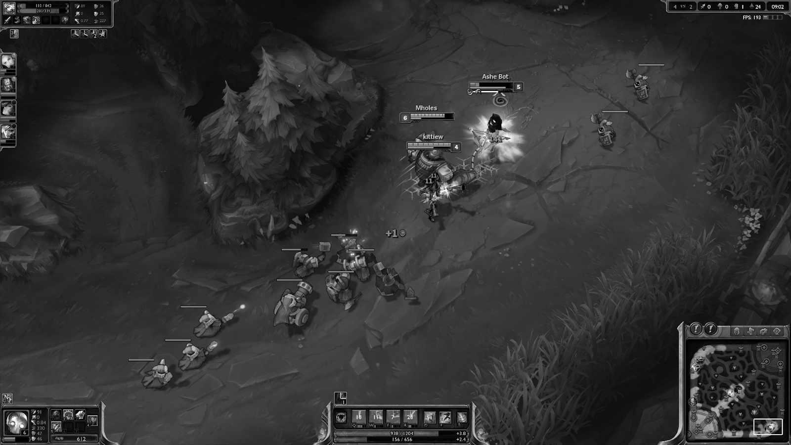
Players faces, Health bars,UI and edges of the Lane/Map have the Darkest Values and highest range of contrast, which aids the player by encouraging their eyes them to view these first. The next example shows the screenshot with only 10% of these black and white Values showing emphasis on what role colour plays in the game.

As well as the players teams Blue and Red. These are the least common colours amongst the environment which mostly consists of greens and subtle browns. When viewing the environment these colours attract your attention more reflecting their importance to the player.
Also notice how health bars are kept in these colours outside of the UI because they are easier to read amongst the green environment and reflect the units team colour.These decisions in colour contrast retain their importance regardless of the chosen colour for the environment or teams, it is the relationship the types of actors/assets art have with one another which improve the game's visuals.

Similarly when the Black and Values are inverted the relationship the assets share with one another still apply. It’s the consistent relationship the art decisions have together which affect whether they read well or not.

As with all game art, it is game specific as to how these decision should be made. But in understanding the decision you can make with your art, will greatly improve its effectiveness of the course of any project from prototype graphics in a games jam to High end triple A development.
Thanks for reading,
-Andy
No comments:
Post a Comment